This month at Add In Marketing in Ventura County, we have been working with various businesses on re-branding their companies. This sample, is a new logo Add In Marketing developed as part of the new branding system for one of Keller Williams top-selling real estate teams in California.
In the last few months we have seen it all, companies with no logos and some companies that have copied images straight off the internet and are using them as logos.
Why is your logo so important? Well, simply stated, your logo defines the overall direction and vision of your company. It defines (or should define) what your target market is, what your clients are willing to spend on your services and the growth vision and ability for your company.
Let’s dive in a bit deeper to understand how crucial this marketing mission is.
Your Long-term Vision:
I am sure you have heard that saying – be careful what you wish for? Well, that statement has a positive spin when you think about your logo and branding approach. If your goal is to be like one of your competitors in five years, look at your competitor, or a company you admire and study what made them great.
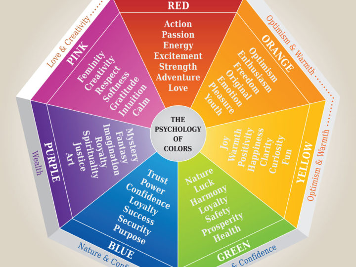
Many times I have heard, “Don’t use this color because it will induce angry feelings”….or other mythical statements that somehow ties all logos into ultimately being square, blue and conservative. Not to say that conservative is bad, but every company is unique, your logo should be as well.
The Ability to Forecast Revenue:
Your logo should ultimately be a good gauge of what markets you are targeting and how much clients will be willing to spend on your services. It must be able to meet a range of uses to attract the volume of customers you are looking for.
Let’s look at two very successful companies. Take Target for example, their logo is large and red, easily defined and easily seen from far away. Target’s marketing communications translate to the consumer that their pricing is competitive and easily attained as well. Another example is Keller Williams Real Estate. They recently just re-designed their logos and branding to move towards a much more upscale look and feel, using simple lettering and a beautiful accent red.
While both companies have different target marketing approaches, different price points and even some overlap, they are both successfully using logos to their advantage and communicating them with proper marketing to the customer.
Working with the right marketing company to define your brand image, vision and growth ability is a very important decision. Your communications should easily be able to translate your vision across multiple platforms and for many uses. Trust a marketing company, like Add+In Marketing, to realize your vision and brand personality. Re-branding or re-vamping your brand is essential to move with the market trends as well, review and renew your vision and get inspired today.

0 Comments
Leave a reply
You must be logged in to post a comment.